
UX Research
UX research that fits the need
Every project has unique needs, timelines and resources. These are my most used methods.
Quantitative Research
Gorilla
Small user sets done with an iPadA/B Testing
Prototype sessions and design iterationUserTesting Sessions
Non-moderated testingSurveys
Discovery on general topics
Qualitative Research
User Interviews
Live prototype testingField Studies
In-person observationTask Analysis
Understand current and ideal processUsability Testing
Analysis & Synthesis
Rainbow Charts
Recording how usersAffinity Mapping
Look for patternsThink-Aloud
Analyze what the users saidDocumentation
Recommendations
A/B Testing Gorilla Style Example
The following lays out an example of time sensitive testing to validate and help with decision making.
Context
The request was to add an edit functionality to a busy page. The user would have to click on something, an other page in our system would open, and the user would have to navigate back to the original page. Additionally, the items that the user could edit were controlled by the Admin and could be different from session to session and client to client.
The PM was in favor of an inline blue text link and using the existing navigation to return. I was thinking a button to open the page and a modal with option to return to might work better.
Concerns
My main concerns were:
The inline links would get lost due to the existing busyness of the page.
A similar inline links initiative that triggered a drawer to open was already in development.
The stacked inline links would have touch zone issues.
The pattern associated with the links would be unreliable. User would not know before clicking if the action would happen on that page or another page.
Users would get annoyed by having to use the normal navigation to go back to the original page.
I felt a test was needed to see which approach would work best. My concerns were only hunches and I wasn’t certain if they were true. I opted to test all the ideas equally and use data to decide. I felt this was the most fair.
Test Setup
Due to the timeline I only had 3 days to test, iterate and get the PM on board. I created a simple Figma click thru prototype for the 2 options: A. Link with regular navigation to return and B. button with modal to return. I loaded these on my iPad. Our hourly employees used this page so I only had wander the halls a bit to find 5 real users.
I took a junior designer with me to take notes so I could observe the tests and as a learning opportunity for new designer. To capture quantitive data, I created a sheet with columns and a space for notes for the junior designer to use. The columns were for things like preferred link, preferred button, preferred navigation, preferred modal, etc. As the question asker and observer, I was paying attention what they doing during the test.
The test I created was simple and took 5-10 minutes to complete. I asked them to:
look at the page to see what was new.
edit the feature while narrating their thinking so I could observe.
return to the original page.
tell me what they thought about what the just did.
repeat with other test.
tell me which one they preferred and why.
My note taker wrote down quotes and marked in the columns. After the tests I added my impressions on the difficulty to finish the tasks and where they struggled.
What was Tested
Ultimately, I ended up doing 3 rounds of testing for links vs buttons and iterated the prototype based on the feedback of the previous test.
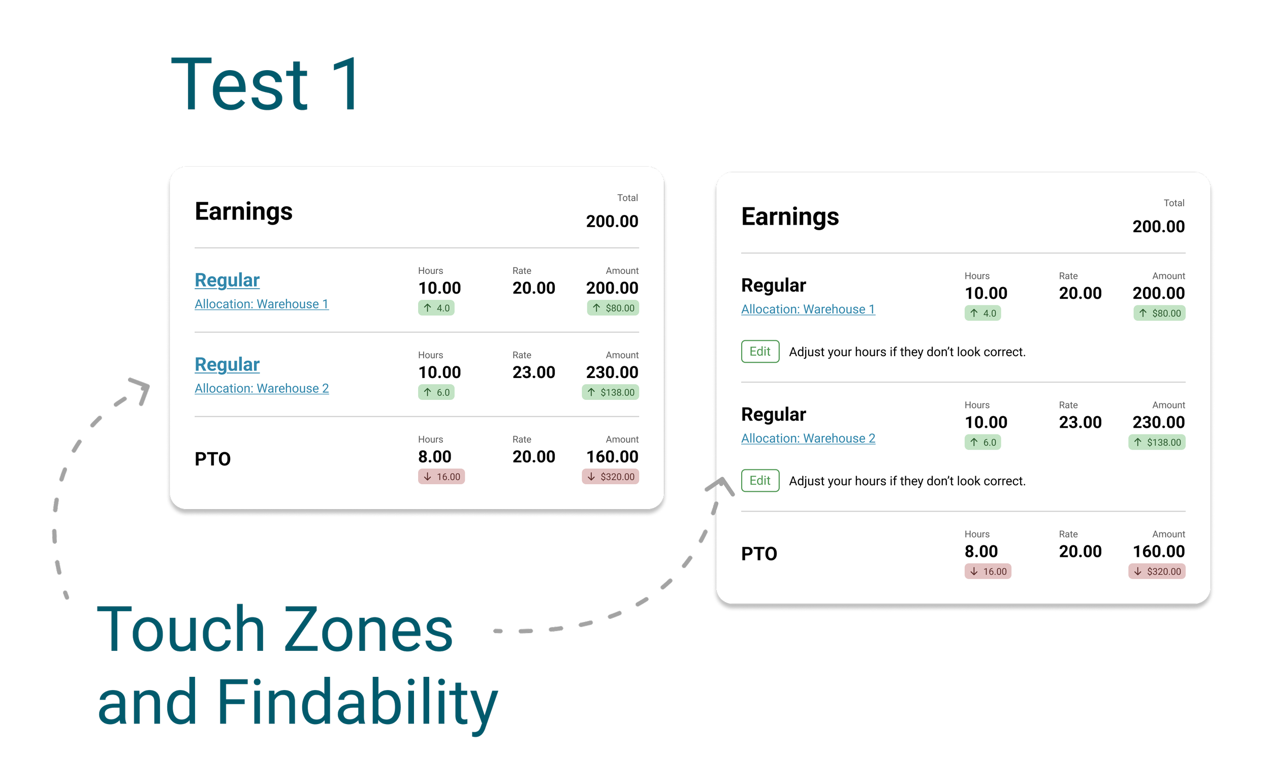
Test 1
Links vs. outlined edit button on own line under item.
Test Goal - validate the touch zones and see how easily the users could the users find the links and buttons (findability).
Unique users tested - 8
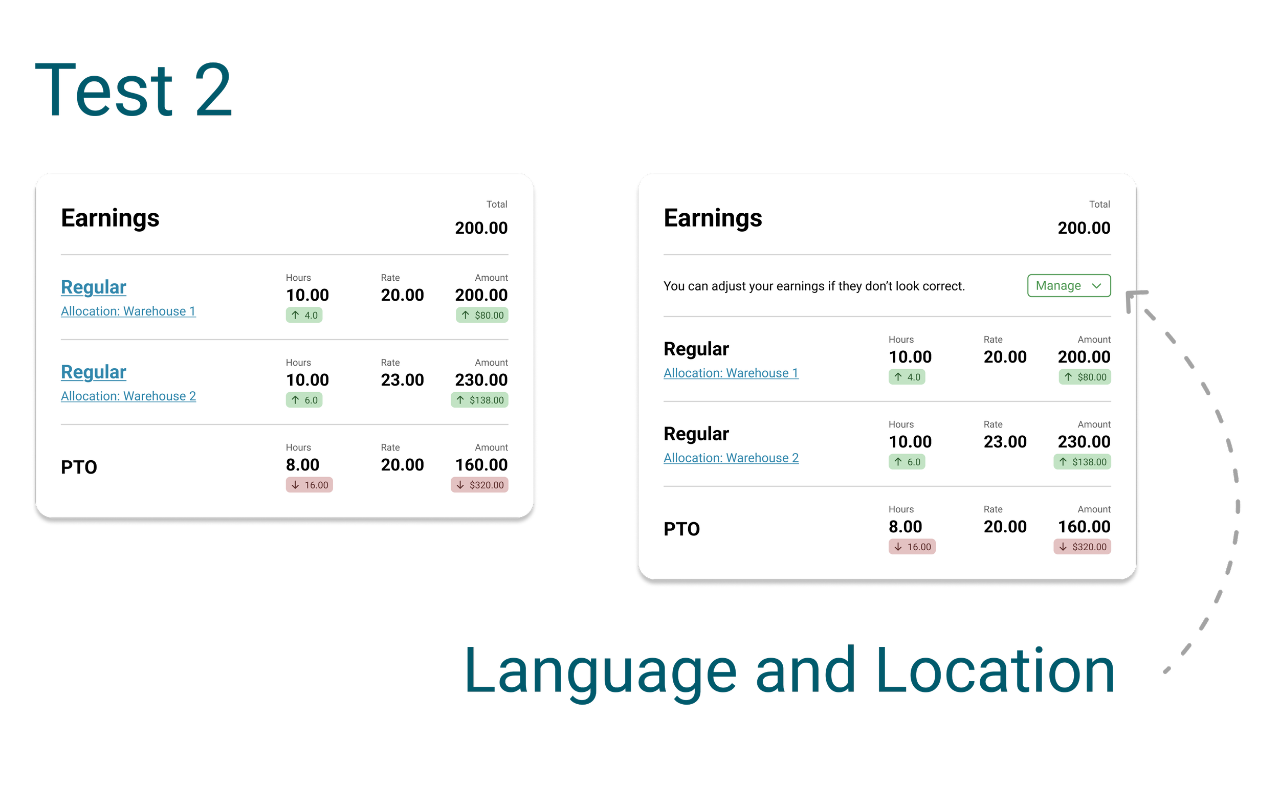
Test 2
Links vs. text “Manage” split button button.
Test Goal - evaluate the language and postion of the button.
Unique users tested - 5
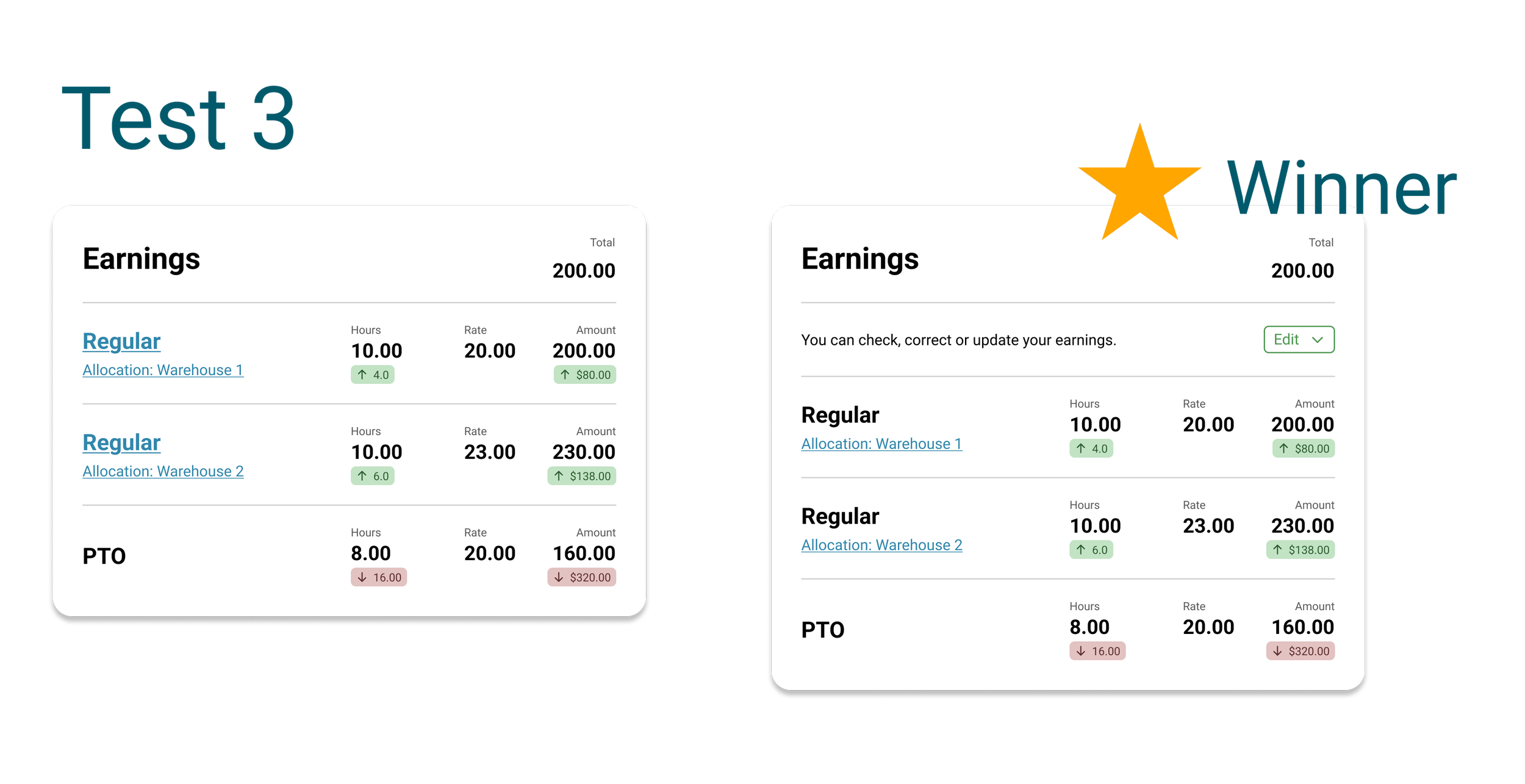
Test 3
Links vs. text “Edit” split button button.
Test Goal - evaluate the language and postion of the button.
Unique users tested - 5
Outcome
I compiled and analyzed all of the data collected. The split button version of test 3 was the winner. This option was also the easiest for the engineers to inject and control the variable content without affecting the front end layout of the items.
NOTE: Images are recreations that reflect the researched aspects of the feature but are not the real project files.